
In the world of digital signage and large-format displays, visual clarity is not a luxury but a necessity. LED screens are designed to communicate information quickly, often in environments where viewers have limited time, varying distances, and changing lighting conditions. Whether the display is used in retail, outdoor advertising, transportation hubs, or corporate environments, readability determines whether the message succeeds or fails.
LED display readability is influenced by multiple design factors, but fonts and colors play the most critical role. A poorly chosen typeface or color combination can render even the most expensive LED screen ineffective. On the other hand, thoughtful design choices can dramatically enhance comprehension, brand perception, and user engagement. Understanding how typography and color interact with LED technology is essential for anyone designing content for these screens.
This article explores the principles behind font and color selection for LED displays, explaining not only what works best but why. By examining human visual perception, technical constraints of LED screens, and real-world use cases, we can define practical guidelines that ensure messages remain legible, impactful, and professional.

How Human Vision Interacts With LED Displays?
To understand readability, it is important to begin with how the human eye processes visual information. Human vision is highly sensitive to contrast, motion, and color differences, especially when viewing content from a distance. LED screens, by their nature, emit light rather than reflect it, which changes how colors and shapes are perceived compared to printed media.
Brightness levels on LED displays are typically much higher than on traditional screens. While this allows visibility in daylight and outdoor environments, it also increases the risk of glare and eye fatigue if design elements are not carefully balanced. Fonts with thin strokes or low contrast colors may appear distorted or washed out under high brightness conditions.
Distance also plays a crucial role. As viewing distance increases, fine details disappear first. This is why font weight, spacing, and color contrast must be optimized specifically for LED environments rather than borrowed from web or print design standards.
Font Selection Principles for LED Readability
Typography is the backbone of readable LED content. The primary goal is instant recognition, not aesthetic complexity. Sans-serif fonts are generally preferred for LED displays because their clean lines remain clear even at lower resolutions or longer distances.
Fonts with uniform stroke width perform better on LED panels, particularly when pixel pitch is relatively large. Variations in stroke thickness can cause certain parts of letters to disappear or blur. For this reason, fonts designed for signage, wayfinding, and digital displays are often the safest choice.
Spacing is equally important. Adequate letter spacing prevents characters from blending together, especially when motion or animation is involved. Line spacing should also be generous, allowing the eye to move naturally across the message without strain. Decorative fonts may work for short brand elements, but they should never be used for primary informational content.
Color Psychology and Functional Contrast
Color selection affects both emotional response and functional readability. From a technical perspective, contrast is the most important factor. High contrast between text and background ensures visibility across different lighting conditions and viewing angles.
Light text on a dark background is often preferred for LED displays because it reduces glare and improves comfort during prolonged viewing. However, outdoor applications may require different approaches depending on ambient light. Bright backgrounds with dark text can sometimes perform better in direct sunlight.
Color psychology should support, not override, readability. Brand colors can be incorporated, but they must be tested for visibility on LED screens. Subtle color differences that work in print may be indistinguishable when rendered through LED pixels.
The balance between aesthetics and function becomes especially critical in environments such as a LED Video Wall for Retail Stores, where visual appeal must coexist with clear messaging. In these spaces, readable design directly impacts customer behavior and purchasing decisions.

Resolution, Pixel Pitch, and Design Limitations
Technical specifications of LED displays impose natural limits on font and color choices. Pixel pitch, which defines the distance between individual LED pixels, determines how much detail can be displayed clearly. Screens with larger pixel pitch require bolder fonts and simpler color transitions.
Designers must account for these limitations during the content creation process. Fine gradients, thin lines, and small text elements may look appealing on a high-resolution monitor but become illegible on an LED screen viewed from a distance.
This is why collaboration between designers and technical teams is essential. A professional LED wall installation ensures that screen specifications align with intended content, but readability still depends on informed design decisions that respect hardware constraints.
Motion, Animation, and Readability Balance
Motion is one of the most powerful features of LED displays, but it can also harm readability if misused. Animated text, transitions, and effects should enhance clarity rather than distract from it.
Slow, smooth animations allow the eye to track content comfortably. Rapid movement or excessive effects can cause motion blur, especially on large displays. When text moves, font weight and contrast become even more important to maintain legibility.
Designers should also consider viewing time. In environments where viewers pass by quickly, such as streets or shopping centers, messages must be readable within seconds. This principle is particularly relevant when considering How to Choose Outdoor LED Advertising Display solutions, where readability under motion and sunlight is a defining success factor.
Contextual Design for Different Use Cases
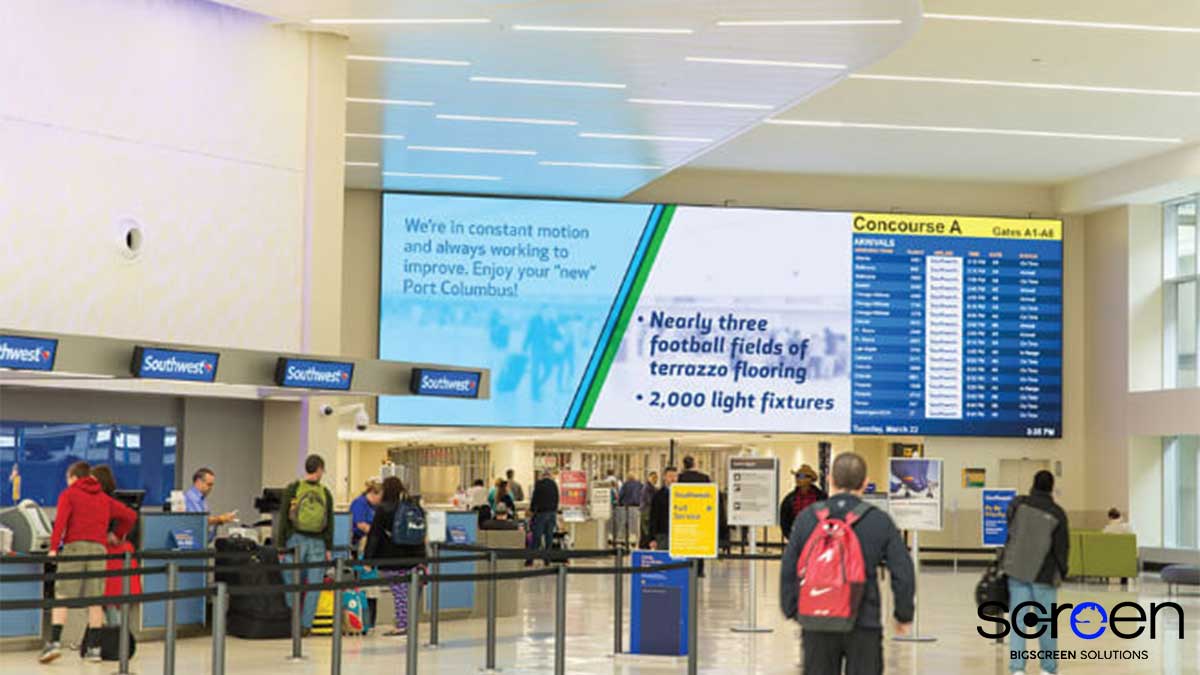
Not all LED displays serve the same purpose, and readability requirements vary accordingly. Informational displays prioritize clarity above all else, while promotional displays may allow slightly more creative freedom as long as the core message remains clear.
In retail environments, screens often serve multiple functions: attracting attention, conveying promotions, and reinforcing brand identity. Choosing the Best LED Screen for Small Retail Stores involves not only hardware selection but also content design that maximizes readability without overwhelming limited physical space.
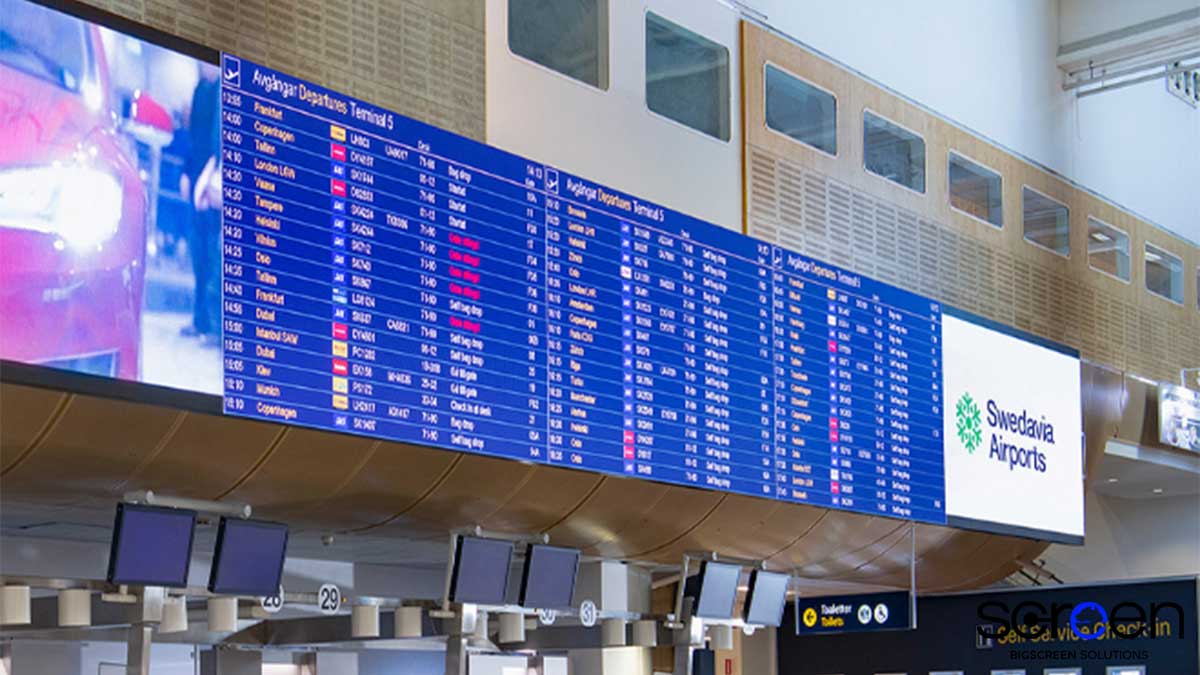
Public information systems, on the other hand, demand strict readability standards. Fonts must be universally legible, color contrast must accommodate visual impairments, and content must remain clear from multiple angles and distances.
Consistency and Brand Integration
Readable design does not mean sacrificing brand identity. Consistency in typography and color usage across LED displays strengthens recognition and trust. However, brand guidelines must sometimes be adapted for LED environments to maintain readability.
This adaptation may involve adjusting color brightness, increasing contrast, or selecting alternative font weights that align with brand style while remaining legible. The goal is to preserve identity without compromising communication.
A well-designed LED Sign demonstrates how branding and readability can coexist. When typography and color choices are aligned with LED-specific principles, brand messages become both visually striking and easy to understand.

Testing, Calibration, and Real-World Validation
No design decision should be finalized without real-world testing. Content that looks perfect in design software may behave differently once displayed on an actual LED screen. Factors such as ambient light, viewing angle, and surrounding visuals all influence readability.
Testing fonts and colors on-site allows designers to identify issues before deployment. Calibration ensures consistent color reproduction across panels, preventing uneven brightness or color shifts that reduce clarity.
This testing phase is often overlooked, but it is critical for achieving optimal LED display readability. Continuous evaluation and adjustment ensure long-term effectiveness as environmental conditions or usage patterns change.
Future Trends in Readable LED Design
As LED technology evolves, new opportunities for readable design continue to emerge. Higher resolutions and smaller pixel pitches allow for more detailed typography, while advances in color calibration improve consistency and contrast.
At the same time, accessibility considerations are gaining importance. Readability standards increasingly account for visual impairments, aging audiences, and cognitive load. Designers are expected to create content that is inclusive as well as visually appealing.
Artificial intelligence and adaptive content systems may soon adjust font size, color contrast, and brightness dynamically based on environmental data. These innovations will further enhance visual clarity in LED screens while reducing manual intervention.
Conclusion
Fonts and colors are not merely aesthetic choices in LED design; they are fundamental components of effective communication. By understanding how human vision interacts with LED technology, designers can make informed decisions that enhance clarity, comfort, and engagement.
LED display readability depends on a balance between typography, color contrast, motion control, and technical awareness. When these elements work together, LED screens fulfill their purpose as powerful communication tools rather than decorative surfaces.
For businesses and brands seeking to maximize the impact of their LED installations, partnering with experienced providers such as bigledscreen ensures that both hardware and content are optimized for readability, performance, and long-term success.